Signs can only be as effective
as they are easily understood
by someone who doesn't care.
"If they can’t find your business, they can’t give you their money." Joe Giral, creative designer for LetterBank Signs + Print
This is guide is a brief overview of sign visibility by way of type size, contrast to the surroundings and ultimately, how readable your sign appears.
Starting with letterform basics: [see terms to know, below]
What is “Type”?
Type is, for our purposes, a designed letter style, created to identify, direct, advertise, inform, embellish and compel. We design with type. That’s the LetterBank Signs + Print specialty. The right type can promote your business image, give clear directions, advertise effectively and inform eloquently.
People may know instinctively what looks good. With LetterBank’s help, you will also learn how and why it looks good, and better still, what works best for your specific project. Whether you are designing a sign for an office in a professional building, a gated development entrance or creating boat lettering, awning graphics, RV names and city or municipal ID, or creating a sign for your organization or school, LetterBank leads the way in customer satisfaction.
Skillful type designers may try to capture the sense of a period of time, an emotion-related feeling or to evoke a mood in their typestyles. Using the correct style for your project is critical to success. Whether you want to catch someone’s attention, or present information in a highly readable manner, LetterBank designs will help.

Terms to understand:
Readability
How easy to read your sign layout is.
Using all capital letters makes it difficult if used for other than one or two highlight words or a brief heading.
Legibility
How readily is your sign understood? A simple sentence structure for a well-thought out singular thought is easier to understand than a casually thrown-together word pie with abundant superlatives and esoteric excesses.
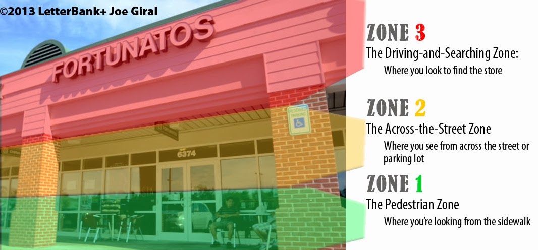
Zones
Is your sign located in the right zone for optimal reading?
Conspicuity
This relates to how well your wording and sign layout stands out from its environment (other signs, visual distractions, trees and shadows, moving distractions, traffic and other visual ‘clutter’).
Ascenders?
The height of characters that rise above x-height . Ascenders may or may not exceed Capital Height.
X-height?

The height of the standard lower-case “x” as it occurs within a typestyle.
Descenders?
The portion of the lower-case letter that falls below, or “descends” the baseline.
Baseline?
The imaginary line along which flat-bottomed type, such as an x, h, l or k, “sits”.
Capital height?
That’s the vertical height of a ‘square’ letters such as an E, X, H, N, K, F, and so on in most fonts. Measuring rounded letters (like O, S, C) may lead to inaccurate or inconsistent measurements.
Why are only “square” letters measured?
In lowercase letters, “rounded” letters, such as o, e, a, g, q and p sit visually below the baseline in many typestyles. Look at the lowercase “a” in the example above. Now compare the line it sits on to the lowercase L (“l”) next to it. The “a” actually sits lower than the l.
LetterBank brings all the elements together for you. LetterBank.com specializes in typographic design.
The “right” typestyle can put your business in a successful light.
Comments
Post a Comment